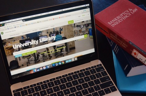
The University of Saskatchewan’s library website is transitioning to a new online format over term two, and as they phase out the old website, students share their opinions, comparing and contrasting the two website designs.

The new library website has made accessing library services easier then before, according to students.
The old library website format will be retired in May after providing students with a portal to online resources and access to facilities since approximately 2010. Over the past year, the library and information and technology department has worked to design an updated version of the website to make it more user-friendly.
On Dec. 20, 2017, the new site was integrated as the default URL, while the old website remains accessible if the user redirects themselves to the old page. Some students give the new website a positive review, like Natalie LaForest, a third-year horticulture student.
“In regards to the library website, I would say the new website looks much more modern, and the new layout is much more appealing, because it lists each of the libraries’ hours. Its resources — as well as booking a study room — are all on the main page,” LaForest said, in an email to the Sheaf.
Shannon Lucky, the information technology librarian and head of the library website project, says that the aim of the project was to create a website that is responsive and mobile-friendly, so students can access the services regardless of what type of device they use.
The updates to the library website have brought changes to improve accessibility, such as less library jargon and more plain language. Some of the new features include the addition of a real-time dashboard that shows the availability of computers in all of the libraries, and on the homepage, the daily hours of operation are displayed for each library.
Justin Norton, a fourth-year crop science student, notes the increased accessibility to online resources that has helped him with writing his undergraduate thesis.
“I looked for journal articles back in November, and there were only a few,” Norton said. “I noticed there were more online sources added, when I checked again after [winter break].”
Lucky explains that the library department wanted to make searching for resources more accessible to students who might be new to academic libraries and that the update was motivated both by appearances and improving technology.
“Part of the impetus was that the site was aging and looking old and out of date. The other side of that push was the integrity and stability of the older technology behind that site,” Lucky said. “We wanted a library website that reflected the quality of our library collections, spaces and services.”
While using the new website, users are prompted to report any errors they spot or take a survey on their website experience. Lucky says she looks forward to any positive or negative feedback from students, as the project is constantly being updated and improved upon. Norton says he has already taken the survey, because he found that the font is too large.
Although students may need time to adjust to the new website format, Matt Struthers, a second-year agronomy student, explains that it offers a more user-friendly access point to the online library.
“It took a while before I could navigate the new site as fast I could navigate the old one,” Struthers said. “Now that I have used it a couple times, I would say it’s easier to use than the older look. I’d say it almost feels like [the] unnecessary steps have been removed.”
—
Rebecca Tweidt
Photo: Emily Sutherland
Leave a Reply