For fine arts students, a Bachelor’s of Fine Arts exhibition is a requirement of the degree, and for the month of March, the Gordon Snelgrove Gallery is entirely dedicated to BFA thesis shows.
I wanted to look behind the scenes and find out more about the process that goes into these shows, so I spoke to a few of the artists hosting thesis shows this month.
I attended the closing reception for a joint BFA show on March 22 that featured work from Lauren Warrington, Nguyen Tran and Kelsey Ford. Each of the three shows was unique in its thesis and artistic intent, exploring varied themes from the commonalities between insects and humans to shifting perceptions of self in the digital age.

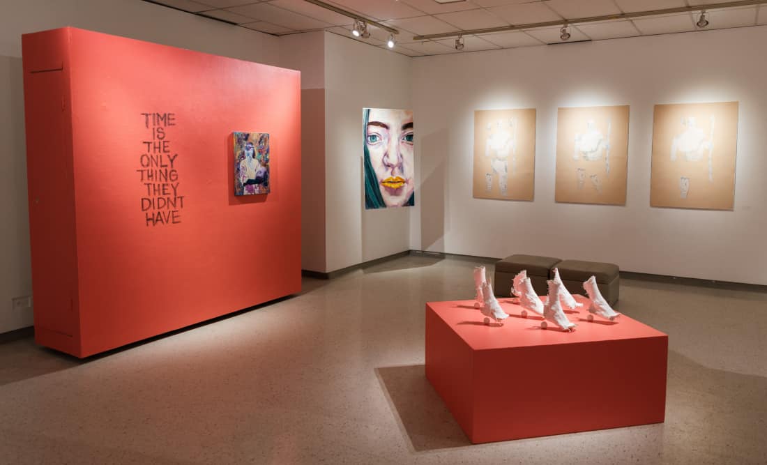
The gallery was split into three distinct exhibits with Tran’s art featured on the right. His show — entitled Time is the Only Thing They Didn’t Have — deals in themes of mortality and the passage of time in a distinctly playful manner. The exhibit featured screenprints and oil pastel works depicting primates and Ancient Greeks — which Tran describes as “essentially the two main characters of this show” — in bright, eye-catching colours.
One of Tran’s pieces, in the end we’re all fragments, was comprised of three screen prints repeating the image of a fractured Greek statue inexplicably sporting modern sneakers. The subtle differences in each of the three images made me pause and look at the art longer than I otherwise might have. Tran’s art is full of little details and little hidden jokes that require a closer look from the viewer.
In an email to the Sheaf, Tran elaborates on the incorporation of humour into his artwork.

“I always incorporate humour in [the] visual language of a piece. My works have lots of comedic aspects in them. I think, through humour, it is easier to deliver serious themes. Humour is the bridge that helps the viewer get to the often heavier messages in my work,” Tran said.
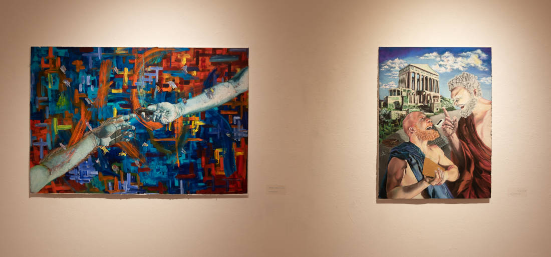
An example of this is the chalk pastel piece this is where it all started, which features two stoic philosophers laughing during a discussion. It’s not immediately apparent, but just off to the side of the frame, you can spot a credit card and some empty drinks on the table. The blending of contemporary culture, historical imagery and vivid colour comes together to produce something compelling.
The burlap and plaster sculpture said we’re going but you didn’t take me served as the conceptual centrepiece of the exhibit. The piece is made up of casts of vaguely human-shaped feet that are cut off at the ankles and once again at the toes.
It’s a quizzical statement that causes the viewer to ask questions. How does this relate to the other works on display? Are the feet stuck in place or are they running from something? Do the shapes suggest human features or do they relate to the oil pastel paintings of primates? The sculpture creates the illusion of both temporal and spatial movement entirely through suggestion.

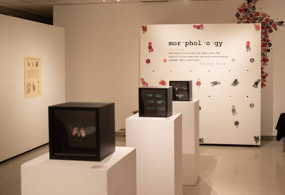
While there is a degree of uncanniness to Tran’s exhibit, Ford’s Morphology outright challenges the viewer with its depictions of human-insect hybrids. The exhibit was located in the centre of the gallery and consisted of shadow-box sculptures, screen prints and a piece made from a typewriter.
Ford’s work is aesthetically pleasing with focused colour palettes and clean lines, but the theme reminded me of the seminal body-horror classic The Fly. Despite its confrontational nature, Morphology contains beauty in its parallels between insects and human bodies. Of the three shows on display, Morphology was the one that grew on me the most as I continued to think it over after I left the gallery.
For the thesis of the show, Ford sought to anthropomorphize insects in the same way we often attribute human qualities to mammals and other animals that we find more endearing.
“I’ve always had an interest in oddities, which I think influenced my overall aesthetic. For my BFA show, I knew I wanted to create pieces that looked like they could be shown in a science museum instead of an art gallery.
“Humans and insects share more similarities than most people would like to recognise. Since insects aren’t romanticized in the same way that humans tend to romanticize animals, it became a need to create works that would show insects in an endearing and almost ‘cute’ light,” Ford said.
The piece that best exemplified the blending of body horror and emotional poignancy was entitled The Internal Reproductive Structure of the Human Heart. The print depicted the human heart as an ant colony, a concept that, on a biological level, is horrifying as it calls to mind ideas of infestation and sickness, but as a metaphor, it’s actually rather sweet.
By presenting the metaphorical in grim scientific reality, Ford’s work excels at drawing parallels between insect species and human beings. By challenging us to look beyond the initially gruesome imagery and relate ourselves to otherwise overlooked parts of nature, Morphology shocks the viewer into thought. It’s an exhibit that I enjoyed on a conceptual level as well as an aesthetic one.
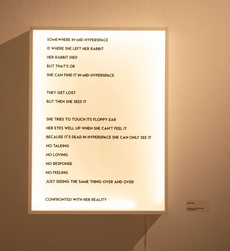
On the left of the gallery was Warrington’s Somewhere in Mid-Hyperspace is Where She Left Her Rabbit, a striking meditation on the nature of online interaction and digital spaces. The Lewis Carroll allusion repaints cyberspace as a rabbit hole of identity, a fitting metaphor when you consider the confounding, surreal and oftentimes frustrating aspects of online culture.
The exhibit’s centrepiece was a virtual-reality experience called Somewhere in Mid-Hyperspace that transports the viewer into a sky-blue digital environment inhabited by giant rabbits sputtering through unnatural looping animations. The piece throws the viewer headfirst into the uncanny valley, and my experience with it left me disoriented for at least a few minutes afterward.
In an email to the Sheaf, Warrington describes her background in 3D imaging and how the project came about.
“I began working with Blender and Unity, two open-source programs, about a year ago for a self-directed project in Jon Bath’s class, Art and the Internet. I created a realm dealing with FOMO that took form as a first-person-player situation. I liked how the environment was immersive and knew I wanted to continue experimenting with the medium. Virtual reality seemed like a logical next step, so I asked Jon about getting a VR rig,” Warrington said.
There’s a moment in the installation where one of the rabbits jumps out at you, and for someone who’s never done VR before, it was pretty unnerving. I heard one of the patrons behind me ask “Are the bunnies jumping all over you?” I must have flinched in response to the sudden change in imagery without realizing it.
I took the headset off, mumbled something in response and placed the hardware back on the hook, unsure if I wanted to immediately go back into hyperspace or avoid it like the plague. It’s a powerful piece of art made even more interesting by its use of cutting-edge technology. The more traditional works in Warrington’s show were equally fascinating.
On the side opposite the VR rig, there were three Plexiglas installations with disorienting prints featuring fragmented alien-like female figures and hairless rabbits. Much like the VR installation, I found that these three pieces also provoked a change in the perspective of the viewer.
On my first pass through the gallery, I was focused mainly on the installations themselves, but as I walked through in the opposite direction, I found myself focusing on the shadows that they produced and appreciated the thought that must have gone into lighting the gallery. Warrington agrees that the lighting was critical.
“Yes, lighting was a major focus during install. I chose Plexiglas as my support because it is both synthetic and transparent. I like how polymer speaks to mechanical reproduction, technology and consumerist culture. The smooth shiny surface is too perfect to be organic, and I felt it was necessary to create shadows in order to give this static material a sense of life,” Warrington said.
Warrington’s work is a great example of thought-provoking modern art that deals with contemporary social issues and a changing digital climate. The VR experience may have been the main draw for some, but the rest of the pieces on display equally explored the conceptual underpinning of the entire project.
In looking at each BFA exhibition up close and talking to the artists, I was struck by how thematically cohesive each student’s work was. The exhibition may have lacked the polish of a show by a major international artist at Remai Modern, but the rawness of the material and the conceptual innovation was invigorating.
The next BFA show will begin on March 25 with a closing reception on March 29. It will feature art from Rory Hierzer as well as Kaitlin Wong, who currently works as the layout editor at the Sheaf, and Mike Tremblay, who regularly contributes cartoons to the Sheaf .
—
Cole Chretien / Culture Editor
Photo: Riley Deacon / Photo Editor
Leave a Reply