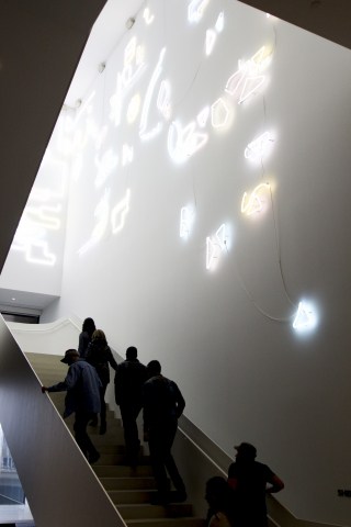
The Remai Modern Art Gallery of Saskatchewan’s long-awaited opening has been met with equal parts critique and praise in Saskatoon. However, when weighing its elements, the space undoubtedly proves to be a cultural achievement for the city.
Saskatoon’s Remai Modern is a technical masterpiece — the gallery is layered and vast, displaying world-class art for the public’s viewing. Though some locals may scoff, I enjoyed the gallery and will continue to do so.
What lies in the minds of the gallery’s creators, curators, architects and designers we can only know in short.
KPMB Architects, based out of Toronto, handled the building’s architecture. According to their website, they sought to “evoke regional agrarian traditions of low-rise, rectilinear sheds and barns” by “connecting the city and the river.”

Remai’s “modern” might soon go stale.
The Remai’s copper-coloured cheese-grater siding is certainly inventive. While it looks beautiful reflected in the cool blue South Saskatchewan River at dusk, on a smoggy day, it just looks like an unfinished construction project. The interior of the building could pass for an Apple Store — while beautiful in its simplicity, it’s not so innovative.
The in-house restaurant, Oliver & Bonacini, was cramped during my first visit, but I can see the space opening up beautifully in the summer months when the deck is available for tables. The gallery itself has been masterfully curated and will continue to attract an audience. My personal favourite was the Picasso collection.
Remai Modern’s visual identity was crafted by karlssonwilker inc., the New York studio of Hjalti Karlsson and Jan Wilker. Hjalti hails from Iceland and Wilker from Germany — an eclectic, diverse duo.
The resulting logo has been met with chagrin in the community. Styled as rRemai mModern, it’s obtrusive and confusing — only detracting from the gallery’s identity. What is this supposed to say about the space, other than design for design’s sake?
As a digitally based agency, karlssonwilker inc. explicitly states on their website that they “don’t use sketchbooks.” An art gallery should feel human, and in an attempt to feel modern, the Remai side-stepped the beautiful imperfections of life to create what feels more like a science lab with a couple of typos.
Referring to any unalterable building as modern is a clear mistake — what is now modern will be always continually evolving. Architecture trends will evolve, graphic design trends will evolve, and what’s trendy now will simply not be in 10 or 20 years. Details like the lower-case “r” and “m,” which do not serve a purpose, will fall by the wayside.
However, the Remai Modern’s design is world-class despite these flaws. It’s an excellent space for parties and gatherings, and — poking out of the riverbank in a seamless and pleasing way — it does make a simple walk or bike ride more engaging. I look forward to enjoying the space, and overall, believe it will serve to intertwine the river landing and the city beautifully.
—
Riley Deacon
Photo: Zac Walters
Leave a Reply